Idea & Concepts
The concept behind the Deeper Blue Borehole Drilling Services logo was inspired by the core purpose of the business, which is accessing reliable underground water sources. The design visually represents the drilling process while maintaining a clean and modern corporate identity.
The upward arrow symbolizes progress, water discovery, and sustainable development, while the circular element represents borehole depth and water flow. The central drill-inspired form reinforces the company’s technical expertise in borehole drilling operations.
Logo Official
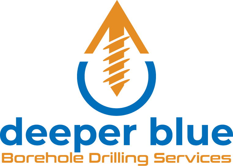
The blue color palette was intentionally chosen to reflect water, trust, reliability, and professionalism, while the orange accent introduces energy, precision, and industrial strength associated with drilling activities.
The goal was to create a simple, memorable mark that communicates both engineering capability and water sustainability.