Japal Global required a modern corporate identity that reflects strength, professionalism, and cross-industry capability. The company operates across engineering, consultancy, manufacturing, and value-added solutions, requiring a brand that communicates trust and global ambition.
The objective was to create a bold, scalable, and internationally credible identity.
Idea & Concept
The core concept revolves around structure, balance, and global integration.
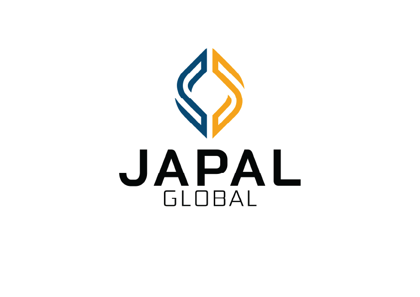
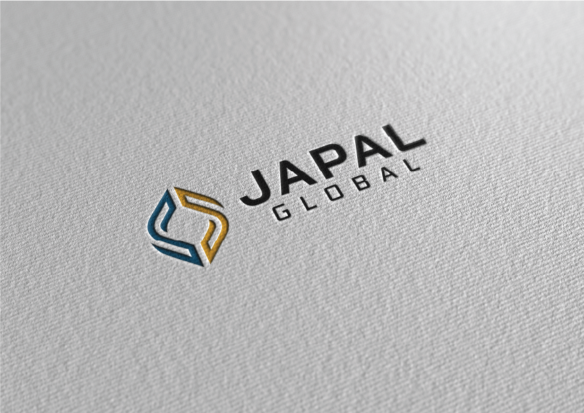
The icon is formed through two interlocking shapes, symbolizing collaboration, partnership, and multidisciplinary expertise. The symmetrical construction reflects stability and engineering precision.
The negative space within the symbol subtly suggests growth and upward movement, reinforcing the company’s forward-thinking approach and commitment to empowering development.
The overall form feels solid and architectural, aligning with the company’s consultancy and engineering orientation.
Design Objectives
• Communicate strength and professionalism
• Reflect engineering precision and structural integrity
• Create a globally adaptable identity
• Ensure scalability across digital and print platforms
• Maintain a timeless, corporate aesthetic
Logo Construction & Symbolism
The mark is built around symmetry and clean geometry, reflecting engineering principles and structured growth.
The interlocking forms represent integration across industries, while the vertical flow subtly implies progress and upward development.
The icon functions effectively as a standalone brand mark for digital use, merchandise, and corporate applications.
Brand Positioning Outcome
The final identity presents Japal Global as a serious, growth-oriented, and internationally positioned company.
The logo system is clean, versatile, and suitable for:
• Corporate documentation
• Engineering proposals
• Industrial branding
• Training and consultancy materials
• Digital platforms