
Water
Fresh Stream Natural Water required a bottle label design that communicates purity, trust, and compliance while remaining visually appealing on retail shelves. The objective was to create a clean, modern, and informative label that balances branding with regulatory requirements.
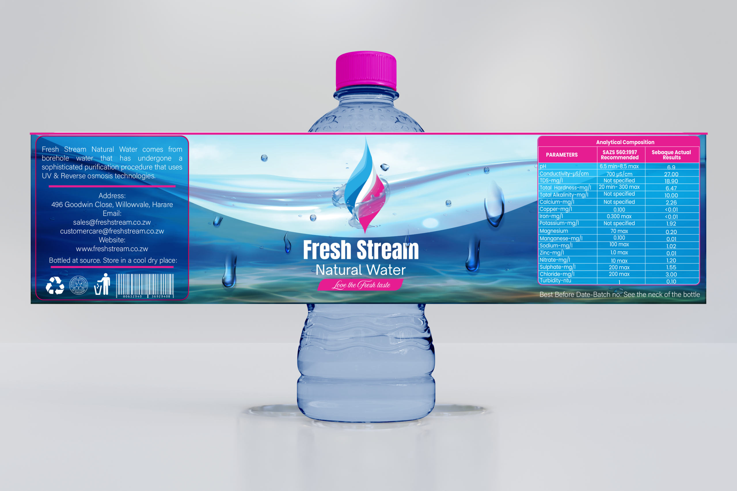
Idea & Concept
The concept was centered around purity and movement. Flowing water elements were used to visually communicate freshness and natural origin. The layered wave design creates depth, reinforcing the brand name “Fresh Stream.”
The central droplet icon represents purity, filtration, and life. Its dual-tone treatment adds a contemporary touch while subtly suggesting advanced purification technology.
The overall layout was designed to ensure that the brand name remains the focal point, while mandatory product information is clearly structured for readability and compliance.
Design Objective
• Communicate freshness and purity instantly
• Ensure high shelf visibility
• Maintain a clean, modern aesthetic
• Integrate analytical composition information clearly
• Balance branding with regulatory details
Color Strategy
Blue dominates the palette to symbolize water, purity, trust, and hydration. Pink accents were introduced to create shelf differentiation and add warmth, helping the product stand out in a competitive bottled water market.
The gradient transitions enhance depth and mimic the natural movement of water.
Typography Choice
A bold, clean sans-serif typeface was selected for the brand name to ensure legibility at a distance. Supporting text uses a lighter, structured typeface to maintain clarity in technical and analytical information sections.
Hierarchy was carefully applied to guide the eye from brand to product type, then to detailed information.